Tuesday, April 10, 2007

Wow, it's been awhile!

It's been awhile since I've posted on this blog!

This is more of a message for those visiting here instead of my newest graphic design blog and letting you know about my contest to 2 months free ad space on my new graphic design blog sean-dinner.com.

My new blog has gone through many changes lately, new themes, graphical banners, new RSS icon, reviews, wordpress widgets, I've changed just about everything! So, check out my newest graphic design blog today! Also note, it's not just all about graphic design, I also share my personal work experiences as a pizza delivery boy and other personal/good stuff! Thanks for visiting!

Monday, March 19, 2007

New Theme for the Sean-Dinner.com Blog

This afternoon and a little bit into the night I started and completed a new theme/look for my Wordpress blog Sean-Dinner.com.For those visiting this site please take a look since it's my most recent and up to date blog. Leave a comment there and let me know what you think. Thanks!

Tuesday, March 13, 2007

Everything Good so far


I've finally have been able to start posting on my new blog! For some reason it had kept messing up and whenever I posted it would put them in random spots instead of a the top :S. Plus, some things just wouldn't work right. But, after 6 re installations of Wordpress I've found the themed I like and have begun posting! My two tutorials have m=been posted over there and I'll begin with my daily rambling once I have something to ramble about lol. Check out my new blog!

Monday, March 12, 2007

Made the switch.

Well, as the title says I've made the switch... to what though you ask?

My own domain! As I right this my domain is not registered so there is nothing to see but a "Cannot be found" page. That should change by in the next day or two.

I've already got Wordpress installed so, I got that over and done with. It was very easy to do since my web host (AnHosting.com) uses Fantastico which enables you to install Wordpress (and other nice features) without doing anything but putting in a bit of info. It literally took seconds to complete.
My site will also be used to host my online portfolio that I need to start working on. It's so hard to find time with so many projects on the go for school. I'll try to get a layout done asap and get my best work up.

Sunday, March 11, 2007

New Photos @ Flickr!

I finally got around to adding my latest photographs to my Flickr.com account.

Check out my new pics at Flickr.com!

It was an aweosme day out the other day and was able to grab some great scenery shots out over the fields. I'm happy with the results :).

Saturday, March 10, 2007

Sitepoint.com


Sitepoint.com

I found SitePoint awhile ago when I was searching for different freelance sort of websites. They have tons of great information and have a system wet-up where actual companies or groups and organizations can start a competition where anyone can enter.

This is a great opportunity to get your name out and show off what you have to offer. There are a lot of member though producing great work. So, it's a little tough unless you have lots of time and put all of your effort into your contest submission. The down side to this, as with any contest, is that you are not guaranteed to win after putting so much time and effort into your creation, so it does feel at times that you "lose money."

Overall though I would Sitepoint.com is great site that everyone should check out. They do offer other services. They offer:

The design contests are in the following categories:

Updated My Labels

For some reason I had forgot to put in labels for most of my posts. But, I got around to doing it so, it'll makes it a little easier to find what you're looking for by using my label list on the bottom right of the side bar :)

Idea Designs.ro

Idea Designs.ro

A great portfolio site I found hidden away in my bookmarks. I forget how long ago, or how I came across Idea Designs.ro but, it was still in my bookmarks so I decided to visit it.

There is some awesome work he has in his portfolio. And site is very well set-up. Nice and simple, and best of all done in flash.

I suggest just checking out Idea Designs.ro and take a look around

Friday, March 9, 2007

Adobe Photoshop CS3 having 2 Versions • Say What?!?


Another interesting email I received today from Adobe. Apparently there will be TWO versions of Photoshop CS3.

The 2 versions are:
• Adobe Photoshop CS3
• Adobe Photoshop CS3 Extended

CS3 will be your "normal" styled Photoshop, with many new great features. The CS3 Extended version though will allow more multimedia abilities, as well as accurate measurement, analysis, and visualization tools. Click to read more.
Adobe seems to be bringing surprise after surprise. Great job Adobe!

My Stickers.

Here are the four stickers that I came up with for my sticker project.

For these stickers I wanted to have a more funny side to it. The client wanted whatever we could think of, so there wasn't a limit on what we could come up with. Although you could say these aren't too creative, I still think what I came up with would sell.

As you can see we were limited to certain Pantone Colours, so we couldn't get too wild with those. Also, only certain shapes and sizes were allowed to be used. The yellow background on the "Warning!" sticker is in place of the orange/yellow reflective material, the stuff you see on contrsution vehciles and such. So, it'll look much better on that reflective material than on yellow.

I'm Going To Make Myself a Cartoon!

Had a nice little idea the other day. I'm going to try and come up with a "cartoon image" of myself. Once I get some free time I'll start drawing some ideas up...hopefully it'll turn out okay. I'm also hoping that'll my cartoon self will help get a little more attention drawn to my site, no one likes reality anyways lol.

Thursday, March 8, 2007

Introducing web conferencing from Adobe

I received an interesting email this morning from Adobe talking about their new online conferencing program called Adobe Acrobat Connect. From the site,
" • Unlimited web meetings for up to 15 people

• A personalized URL for all of your meetings

• Integrated screen sharing, video, and teleconferencing

• No software downloads for meeting participants*

• Ability to collaborate on the same file"

Although I have no use for this yet, it sounds like a great idea that will save tons of time since you no longer have to send the file to everyone and what for them to send it back.

Check out the info on Adobe Acrobat Connect.

Wednesday, March 7, 2007

Presentation Went Good

My presentation today went good. I got a 4 out of 5 from the teacher, so that's not bad. We'll be notified within a week about whether our stickers were chosen or not to be sold, then another week to get the final marks back on our project. So, we'll have to wait and see what happens!

Just a Reminder

Just a reminder about my first and second tutorials on my first page. Let me know what more you would like to see! Thanks!

Big Presentation Today

At 12:00 PM I have a presentation to do. Normally presentations of our projects aren't bad for me but, today we are doing it infront of the class AND actual clients. This'll be a little more nerve racking though. Our project was to create 4 stickers for International Nameplate Services following their specs and using a limited amount of colours.

The cool part about this project is that if our stickers are chosen, they'll be sold by INPS and we'll be able to make some royalty money. Wish me luck!

Tuesday, March 6, 2007

Welcome to Bitey Castle - - Adam Phillips


Welcome to Bitey Castle - - Adam Phillips

If anyone has some free time I suggest checking out this site and watching some of the flash animations.

I remember watching one of the flash videos on NewGrounds.com awhile ago but, never went to the site until now. And let me tell you, I wish I had gone a lot sooner.

Welcome to Bitey Castle by Adam Phillips produces some amazing flash movies. The skill he has plus the time and creativity he puts into these flash movies is insane. I loved watching them. Check it out now!

PayPerPost: Design our New Affiliate Badges

PayPerPost: Design our New Affiliate Badges


A cool contest being held at PayPerPost.

I'm hoping to get some time to throw something together for this.

Monday, March 5, 2007

New Interactive Design Project

We received our brief today about our second project for my Interactive Design class. We have to create a slide show type of site using Flash. We did a tutorial a couple of weeks a go on how to do this, but this time we have to get the pictures and come up with our own design. Should be fun, I hope.

Sunday, March 4, 2007

The Importance Of Deep Linking � John Chow dot Com

The Importance Of Deep Linking � John Chow dot Com


Here's another great article by John Chow on the importance of deep linking, if the title didn't give it away already. He talks about why deep linking is important and how it can benefit you and your blog. I suggest reading it over once or twice and put his advise to use, he knows what he'd doing ;).


I know this has nothing to do with graphic design but, it's still useful information that you can put to use.

I have also posted this at my other blog so I could let you know about John Chow (if you haven't heard of him already) depending on which 2 (for now) of my blogs you can to.


Thanks for reading!
Remember, comments are always welcome and ideas/questions would also be great! Thanks!

Spicypage

Spicypage | Submit your site or blog free, let community vote on it, view most popular


I've just found this site and added this blog to it. It seems like a nice community to post your site and have people rate and comment on it, also good to help get some traffic coming your way. Since I just signed up I can't really say much about it, but it's worth checking out!

Fanshawe Graphic Design

Fanshawe Graphic Design.

If anyone is interested here's my college's Graphic Design course website. This is where we go to check out our newest projects at our teacher's website. They also offer job opening and all that fun stuff! The site is nice and simple, I believe it was created by one of the current teachers...it would only make sense lol. So, check it out!

Saturday, March 3, 2007

Completed Tutorial


So, I ended up starting and finishing the tutorial I had talked about earlier. Here is what I came up with. The above image is a preview, the link will take you to the actual coded layout.

I ended up changing the colours, as you'll see, and I also coded the template using good ol' tables. I know the big thing is to be using CSS, which IS part of this tutorial but, since I know only a little about CSS I just used tables instead and it worked out perfectly. Plus, I soon have to go to work so time is limited.

Full credit of the tutorial goes to Arthura at Pixel2Life.com for the tutorial.

If anyone is looking to create a simple, fast loading site, I suggest checking this tutorial out.

Thanks for reading!

A Great Web Layout Tutorial

I found this tutorial on Pixel2Life.com this morning on creating a pixel styled web layout, slicing, and then coding it. I've just started reading it and already love it. It has tons of pages and pictures but, it's better than having none at all.
After reading through it, and once I get some time of course, I'll have to take a go at creating my own web layout following this tutorial. I'll post my results later.

Nissan 350Z Using Adobe Illustrator CS2


For a project last semester in our Digital Illustration class we had to choose a vehicle of our choice and re-draw it/design a poster advertising the car. We were supposed to re-draw it to look as realistic as possible using what ever methods we chose, just as long as it was done in Illustrator CS2. Is used the gradient mesh tool along with just simple gradients and pen tools paths. I can say I'm proud of how it turned out.

Thursday, March 1, 2007

My E-Cover Experiment


So after looking through some tutorials and such on how to create e-covers using Photoshop I did some experimenting. Above is what I've created. It's nothing exceptional but, I did find that Photoshop is much easier to use for doing this than Illustrator is. Using Illustrator you can use the 3D Effect and map art to create the 3d box, with Photoshop just use the Perspective Transform tool and it's simple!


The creation on the left side is my desktop screen shot turned 3D (yes, that's a wallpaper from carwalls.com) The other is just a simple 3D box with my name and site name. Thanks for looking! Let me know what you think!

Wednesday, February 28, 2007

My Favourite Graphic Design Related sites

It's not much of a list, but it's a list.

1.) Pixel2Life.com
Pixel2Life.com has been my favourite site for last couple of years to visit when in the need of help or just looking for something new to learn. Pixel2Life.com has an insane amount of tutorials available for any program you can think of. They also have a great forum where you can get help from the community, show off your work, criticize others', enter contests, and much more. I suggest checking out Pixel2Life.com.

2.) Good-Tutorials.com
Good-Tutorials.com is another favourite site of mine that offers a huge list of tutorials for Adobe Photoshop. They offer tutorials starting at animation all the way to web layouts.

3.) 13Dots.com
13Dots.com is a graphic design community. A blurb from their site, "... 13dots Community Website where we offer members and guests over 800 FREE learning tutorials, 600 plus quality learning files, Blogs, Topsites, Arcade, Gallery help and much more."
Sounds fun to me!
I'll admit I'm not very active at all on the site but, when and if I get time I'll go check it out so see what's going on. The first thing that drew me to 13 Dots was their contests. 13Dots.com will hold contests where you can win some great prizes. In their latest contest the first prize was a fully licensed copy of Portfolio 8 valued at $199.95, and the second prize awarded was a fully licensed copy of Suitcase Fusion valued at $99.95. Very nice.


So there's my list of Favourite Graphic Design Related Sites. I'm sure I will find more as I cruise the internet seeking knowledge, and they will be added to my list. Thanks for checking out Your Graphic Design!

30 Days of Wallpapers • GrooveArmy.com


As I was cruising around on MyBlogLog.com I came across the site GrooveArmy.com. They're having a "30 Days of Wallpaper" event going on. Everyday, for 30 days, they have a new wallpaper up for download. I thought this was a great idea and they have some awesome wallpapers available for download. Yes, I know I'm just advertising the competition bet hey, these are some cool wallpapers.

Tuesday, February 27, 2007

3D Photo Effect Tutorial by HV-Designs


Now, here's a cool tutorial I found over at HV-Designs where you take a picture of a vehicle or something similar (in their case they used a tank) and make it look like it's jumping out of the picture. Check it out!

My example is above using a picture from CallWalls.com. This site has some amazing wallpapers.

Ah, the Subaru WRX STI, someday you shall be mine.

Vectorized Face Poster


This was a project we did earlier this semester for our Digital Illustration class. We had to take a picture of ourself then use Adobe Illustrator CS2 to "redraw" it on a 10.5x13inch poster.

So, this is what I came up with. It's not the greatest thing you'll ever see. But I feel I did a great job vectorizing my face to look like me. Thanks for looking.

Monday, February 26, 2007

Car Customization • Lowering Your Car

I'll be "Photo-Chopping" my car to look like it has lowered suspension. Here's the original.
1.) Open the image of your car, or just grab one from Google (be warned of copy write laws, don't claim a picture from Google to be your own).

2.) Grab the Lasso Tool and makes a selection of the car (but not the wheels) and the rest of the picture above that. See example.3.) After doing this (with the picture layer still selected) press Command+J (CTRL+J on PC) or you can go to Layer > New > Layer Via Copy. Using shortcuts makes it a lot easier and quicker to use Photoshop.

4.) It'll create a copy from the picture layer of the area you had selected. Hide the other layers to see the selection. Don't worry if your selection wasn't smooth around the wheel wells, this will be edited out soon. Just be sure that you have ALL of the car in the selection/new layer.

5.) Alright, get the Move Tool (black arrow at the top right of the tool bar, or just press "v") and be sure that your top layer is selected. Using the arrow keys keep pressing down until your car is in a good position and looks realistic. Don't go overboard or else your car will just look ridiculous in the end. You can see mine is now dropped but, there's a problem. We have to edit out all the extra stuff so it looks realistic. I've highlighted in mine where I have to edit.
6.) WARNING: Do NOT use the eraser to erase. As dumb as that sounds, there is a much better way to do it. It's called a "Layer Mask" and allows you to work non-destructively. At the bottom of the layers palette click the square icon with a circle in it to add a layer mask to your layer.

By using the Layer Mask you can "erase" parts of the image, but then can show them again if you want. You do this by selecting the Layer Mask (see above) and using the Brush tool. Black is to erase, white is to un-erase...if that makes sense. This may take a while to do depending on the picture you used. Here's my final...notice the lack of wheel gap? That's what you want! Hope this helps!
Remember to crop the image to get rid of the stuff at the top. Since you lowered the top layer down the layers below will show.

Here's a comparision so you can check it out. Or you could open up the original and the final pictures in new windows or tabs, which ever works for you.

Hex Color Codes

I've just found this site that offers literally thousands of colours and their hex codes. You can find some really cool colours to use when you don't feel like using the basic hex codes. Check out Hex Color Codes.

First Tutorial • Simple Image Editing •

The first tutorial I am going to write for Your Graphic Design will involve editing an image in Adobe Photoshop CS2.
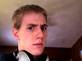
I have started with this photo of me,

and will end with this.

NOTE: Before I begin I must tell you that I'm going to assume that you have basic knowledge of Photoshop and will know what I'm talking about. I'll try to be as specific as possible though.

Alright, lets begin!

1.) Open your image, makes sense right?
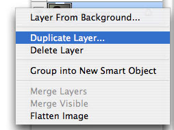
The first thing I like to do is create a duplicate of the original picture layer. You can do this by right clicking the layer and selecting "Duplicate Layer." Another option is to click the layer and hit Command+J (CTRL+J on PC) as a shortcut.
Why are you doing this? By duplicating the layer you are working "non-destructively." This means that if you mess the picture up beyond any repair, you can simply delete it and duplicate the original picture layer again and start over.

2.) Now for the tricky stuff.
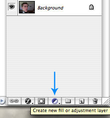
In your layers palette click the "Create New Fill or Adjustment Layer" button and select "Levels..." This is the area where I cannot help all that much. The best thing to do is take the middle slider and move it from left to right until the picture looks good, or as good as you can get it.

3.) Click the "Create New Fill or Adjustment Layer" again and select "Curves..."
This is even more tricky than using Levels and will take more time to get a good result. Practice makes perfect though!

You'll notice that there are now two more layers, this is what you want. By using those tools you can double click the little layer thumbnail and easily edit the settings.

NOTE: You can try the other features too if you like, some might help your picture out better than others.

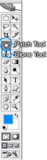
4.) For my picture I duplicated the image again so I could edit out the fan blades coming out of my head.
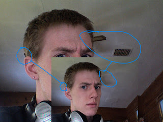
I used both the "Clone" and "Patch" tools. Notice how you can still see the shadows though? I didn't feel like they were too big of a problem so I left them. It'll take some practice to get the patch and clone tool to work how you want it but, once you know how you can do some great things with it. I'm still not the greatest at using them but it's enough for this little project.

5.) This next step is optional but was needed for me. I had to create a new "Levels..." adjustment layer for my hair to appear brighter. I did this adjusting the levels to what I thought looked good for the hair, then painted black on the layer mask to "erase" everything but the hair.

6.) In the original picture you can see my skin doesn't look very nice. I fixed this problem by using the "Blur" tool. Just blur whatever areas you want so the skin will appear to be smoother. You can also use the "Gaussian Blur" filter then set the layer to "Soft Light." I won't go into detail since this is totally up to you to experiment with.

7.) So, in the end my picture looked like this
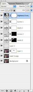
You can see my hair is brighter, no more fan or vent, and my eyes are more blue. In the end this is what my layers palette looked like. Remember that your results will be different. It all depends on the picture you're working with and how you want it to look in the end. This is not a "do this, do that, step by step" tutorial but just some easy tips and hints that will improve your overall image after you do some tweaking.


Good luck and thanks for reading! Feel free to post any comments.

Sunday, February 25, 2007

Welcome to Your Graphic Design

Your Graphic Design has been created by Sean Dinner as a place to come to get tips, tricks, and hints on using all of your favourite design programs from Adobe Photoshop to Macromedia Dreamweaver. I'll be showing and reviewing tutorials that alreadys exist as well as showing what I personally have learned and created in class.